P4D3: From scikit-learn to DALEX/SHAP
Remaining Schedule
| Date | Duration | Details |
|---|---|---|
| 11/29 | 1 class | Final day of ML in Python and open programming |
| 12/1 | 1 class | Day 4 of ML (Now in R) |
| 12/6 | 1 class | Day 5 of ML in R |
| 12/8 | 1 class | Day 6 of ML in R and take home coding challenge started |
| 12/13 | 1 class | Cover letters due |
| 12/17 | 0 class | Grades submitted |
Installation
import sys
!{sys.executable} -m pip install scikit-learn dalex shap
https://ema.drwhy.ai/figure/mdp_general.png
Building our model
After building our machine learning data (dat_ml.pkl), we can start our model.py script.
# %%
import pandas as pd
import numpy as np
import joblib # to savel ml models
from plotnine import *

from sklearn import metrics

from sklearn.model_selection import train_test_split
from sklearn import tree
from sklearn.naive_bayes import GaussianNB
from sklearn.ensemble import GradientBoostingClassifier
Build training and testing data
# %%
dat_ml = pd.read_pickle('dat_ml.pkl')
# Split our data into training and testing sets.
X_pred = dat_ml.drop(['yrbuilt', 'before1980'], axis = 1)
y_pred = dat_ml.before1980
X_train, X_test, y_train, y_test = train_test_split(
    X_pred, y_pred, test_size = .34, random_state = 76)
Building our models
clfNB = GaussianNB()
clfGB = GradientBoostingClassifier()
clfNB.fit(X_train, y_train)
clfGB.fit(X_train, y_train)
ypred_clfNB = clfNB.predict(X_test)
ypred_clfGB = clfGB.predict(X_test)
Diagnosing our model with sklearn
# %%
metrics.plot_roc_curve(clfGB, X_test, y_test)
metrics.plot_roc_curve(clfNB, X_test, y_test)
# %%
metrics.confusion_matrix(y_test, ypred_clfNB)
metrics.confusion_matrix(y_test, ypred_clfGB)
Now we can build our own feature importance chart.
# %%
df_features = pd.DataFrame(
    {'f_names': X_train.columns,
    'f_values': clfGB.feature_importances_}).sort_values('f_values', ascending = False).head(12)

# Python sequence slice addresses
# can be written as a[start:end:step]
# and any of start, stop or end can be dropped.
# a[::-1] is reverse sequence.
f_names_cat = pd.Categorical(
    df_features.f_names,
    categories=df_features.f_names[::-1])

df_features = df_features.assign(f_cat = f_names_cat)

(ggplot(df_features,
    aes(x = 'f_cat', y = 'f_values')) +
    geom_col() +
    coord_flip() +
    theme_bw()
    )
Finalizing our model
We have ignored model tuning beyond variable reduction. You would want to tune your model parameters and evaluate your classification threshold as well.
Variable reduction
# build reduced model
compVars = df_features.f_names[::-1].tolist()

X_pred_reduced = dat_ml.filter(compVars, axis = 1)
y_pred = dat_ml.before1980

X_train_reduced, X_test_reduced, y_train, y_test = train_test_split(
    X_pred_reduced, y_pred, test_size = .34, random_state = 76)

clfGB_reduced = GradientBoostingClassifier()
clfGB_reduced.fit(X_train_reduced, y_train)
ypred_clfGB_red = clfGB_reduced.predict(X_test_reduced)

# %%
print(metrics.classification_report(ypred_clfGB_red, y_test))
metrics.confusion_matrix(y_test, ypred_clfGB_red)
Saving our models
# %%
joblib.dump(clfNB, 'models/clfNB.pkl')
joblib.dump(clfGB, 'models/clfGB.pkl')
joblib.dump(clfGB_reduced, 'models/clfGB_final.pkl')
df_features.f_names[::-1].to_pickle('models/compVars.pkl')
Explaining our model
Let’s create a new explain.py script for our model explanation.
# %%
import pandas as pd
import numpy as np
import dalex as dx
import matplotlib.pyplot as plt

import shap
import joblib

from dalex._explainer.yhat import yhat_proba_default
from sklearn.model_selection import train_test_split


# %%
# load models and data
clfNB = joblib.load('models/clfNB.pkl')
clfGB = joblib.load('models/clfGB.pkl')
clfGB_reduced = joblib.load('models/clfGB_final.pkl')
compVars = pd.read_pickle('models/compVars.pkl').tolist()
dat_ml = pd.read_pickle('dat_ml.pkl')
y_pred = dat_ml.before1980
X_pred = dat_ml.drop(['yrbuilt', 'before1980'], axis = 1)
X_pred_reduced = dat_ml.filter(compVars, axis = 1)

X_train, X_test, y_train, y_test = train_test_split(
    X_pred, y_pred, test_size = .34, random_state = 76)
# may not be the most efficient way to do this
X_train_reduced, X_test_reduced, y_train, y_test = train_test_split(
    X_pred_reduced, y_pred, test_size = .34, random_state = 76)
Using DALEX
# %%
# Create explainer objects and show variable importance chart
expReduced = dx.Explainer(clfGB_reduced, X_test_reduced, y_test)
explanationReduced = expReduced.model_parts()
explanationReduced.plot(max_vars=15)

# %%
# show model performance
mpReduced = expReduced.model_performance(model_type = 'classification')
print(mpReduced.result)
mpReduced.plot(geom="roc")

# %%
# Explain variables
pdp_num_red = expReduced.model_profile(type = 'partial', label="pdp", variables = compVars)
ale_num_red = expReduced.model_profile(type = 'accumulated', label="ale", variables = compVars)
pdp_num_red.plot(ale_num_red)

# %%
# Explain observation
# shapley values
sh = expReduced.predict_parts(X_test_reduced.iloc[0,:], type='shap', label="first observation")

sh.plot(max_vars=12)
Using SHAP
The following two links provide background on Shapley values for model explaining.
The shap package has a few valuable model exploration charts that we can leverage.
# %%
# Build shap explainer
explainerShap = shap.Explainer(clfGB_reduced)
shap_values = explainerShap(X_test_reduced)
# %%
# Show variable importance based on shap values
shap.plots.bar(shap_values)
# %%
# https://medium.com/dataman-in-ai/the-shap-with-more-elegant-charts-bc3e73fa1c0c
shap.plots.beeswarm(shap_values)
# %%
# comparable to the bar plot
shap.plots.beeswarm(shap_values.abs, color="shap_red")
# %%
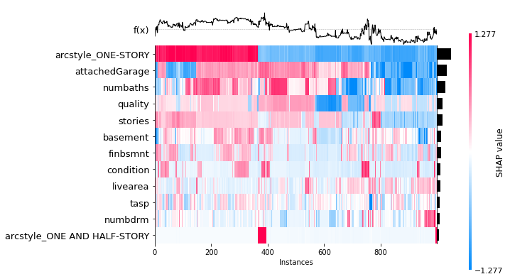
# combine the above charts
shap.plots.heatmap(shap_values[0:1000], max_display=13)
We can also use partial dependence plots.
# %%
shap.plots.partial_dependence(
    "numbaths",
    clfGB_reduced.predict,
    X_test_reduced,
    ice=False,
    model_expected_value=True,
    feature_expected_value=True)

# %%
shap.plots.partial_dependence(
    "livearea",
    clfGB_reduced.predict,
    X_test_reduced,
    ice=False,
    model_expected_value=True,
    feature_expected_value=True,
    show=False)

plt.xlim(xmin=0,xmax=15000)
plt.show()